


Background
Through an old colleague, I found myself in a meeting about launching Hungary's newest creative-project matching platform. The concept was solid, building on the shortcomings of existing competitors. My task was clear: turn 13 pages of rough desktop wireframes into 13 polished, responsive designs, plus a full, functional design system.
Process
My workflow for projects like this when working as a solo designer is simple but effective: design three landing page concepts to set the direction, then develop the rest of the site methodically while building out components for the design system.
Rather than creating a perfect system first and applying it second, I prefer this more organic approach. It lets the system grow with the project’s needs, saving time and allowing for small corrections along the way—essential when working under "needed it yesterday" timelines.
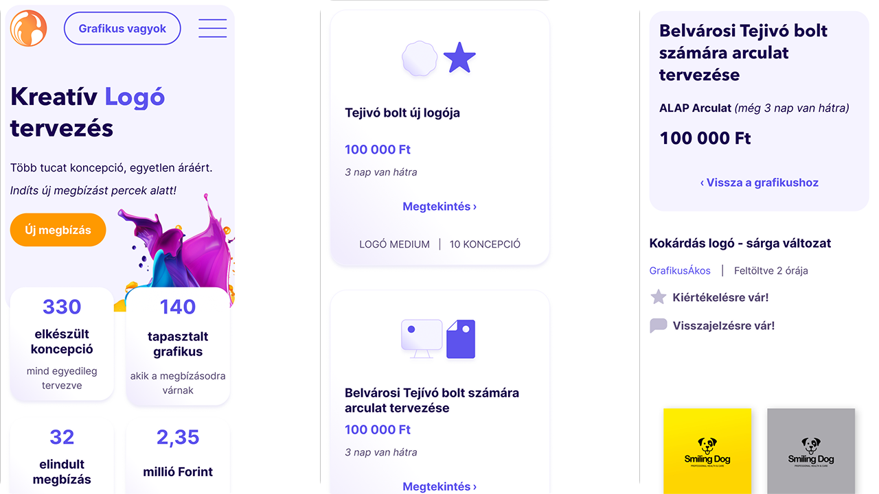
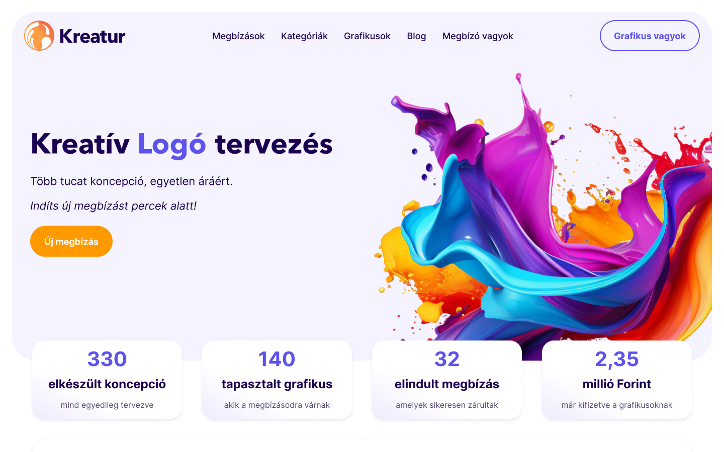
The final result is a playful but modern design, using a complementary purple-orange palette with soft gradients and shadows to create a sense of depth and plasticity. Custom icons and pictograms tied the visual language together.
![]()
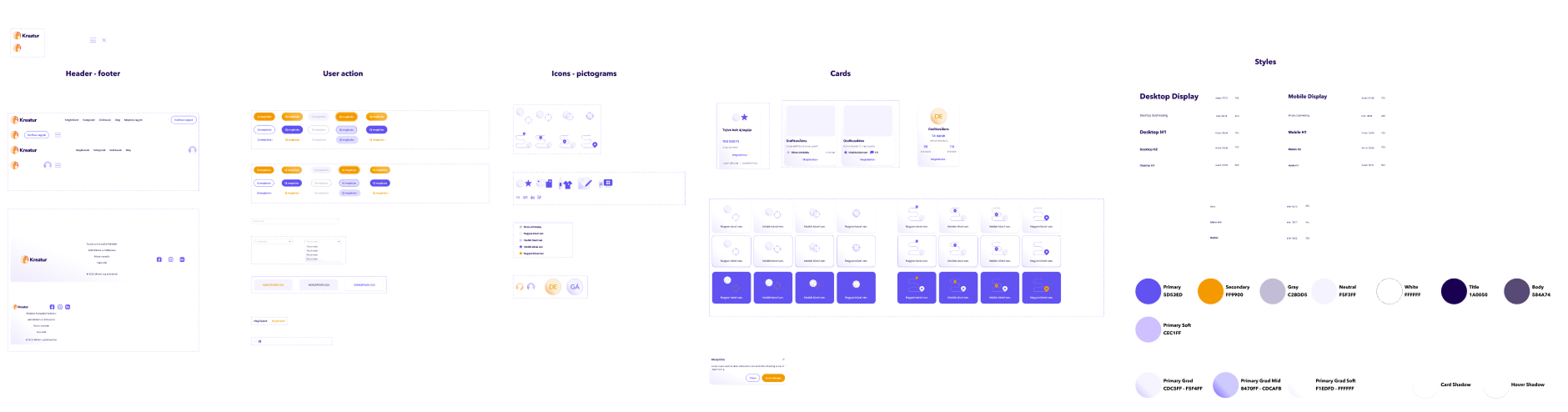
All of it was wrapped in a neatly organized, developer-friendly Figma file, making full use of components, variants, and auto-layout for easy handoff.
Outcome
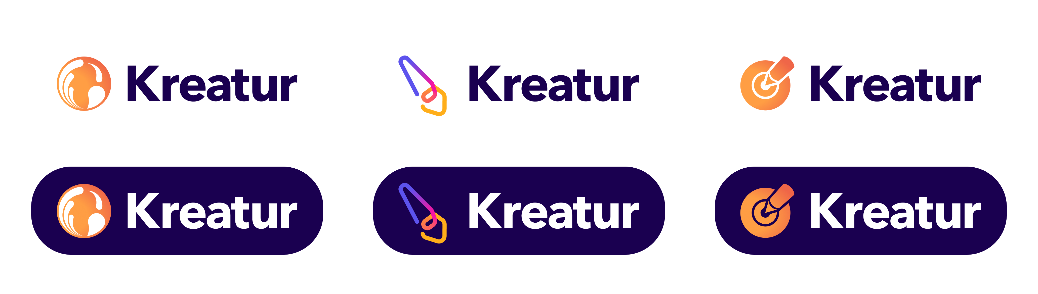
The project balanced bold looks with smart UX, perfectly fitting its creative-meets-professional theme. I also contributed logo variations, one of which the client selected and launched with.
Summary
Building a polished, dev-ready platform design from scratch wasn't completely new. I've designed several systems like this over the years, though many are tucked safely behind NDAs. This project was a perfect blend of creativity, structure, and collaboration.
What I Learned
This project was a reminder of two things: first, the value of personal connections (they’re often the door openers to interesting projects), and second, the importance of keeping a developer's perspective in mind when building design systems. No matter how carefully I plan, there’s always a detail or two that a good developer will catch—and I'm grateful for it.