


Background
I've known Viktor for years. University, jobs, flat-sharing—we've done the rounds. So when he decided to launch his own practice and asked me to help, it felt like the most natural thing in the world. We kicked things off with the usual early-stage rituals: moodboards, inspiration hunts, keyword dumps, and domain debates.
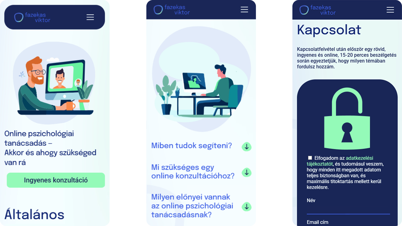
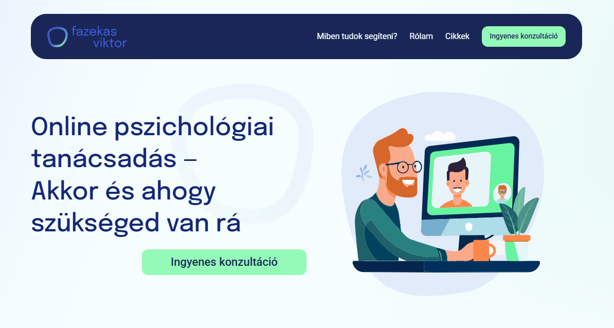
From the start, we aimed for something that felt calm but not cold, professional but still approachable. That idea turned into a color palette of blues and greens—hints of corporate reliability with a human edge.
Branding and Visual Style
The logo idea came early and stuck. A loose, slightly imperfect circle in a soft gradient of brand blue and green.
The site design was a breeze. With the brand vibe in place and a client who trusted me, things just flowed. I kept the layout simple, used bright colors for actions, darker and pastel tones for backgrounds, and layered in some corporate-memphis graphics for good measure. Some of those visuals came from Midjourney, which was a fun experiment in early 2023, though I had to spend more time than I'd like in Illustrator fixing up details.
To tie everything together, I used circular shapes from the logo as recurring design elements across the layout.
Building with Framer
Framer lured me in with all the right promises: a reasonable price point, direct Figma imports, an integrated CMS, and a chorus of design Twitter singing its praises. And to its credit, it delivered on a lot of that.
The CMS was solid. Pricing didn’t cause any friction. Figma import worked better than expected.
But, as always with a new tool, the real work starts when you want to build something even slightly custom.
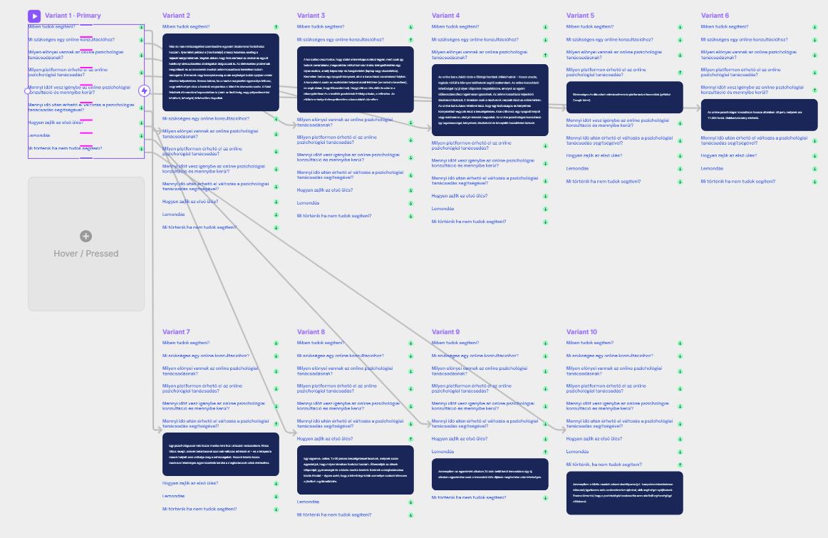
Take the FAQ section. I wanted a classic accordion: open one item, close the others. Seems simple enough, right? In Framer at the time, it meant building a separate component for every possible open/close state and rigging them together. Weirdly tedious and unintuitive.
Then came the contact form.
Form builder didn’t exist in Framer yet, so after some trial and error I wired up Formspark as a third-party solution. This meant writing a code module to define every field, label, checkbox, and button. And yes, this was before GPT could vibe-code the whole thing for me on command, so I spent more time than I’d like in forums piecing it together.
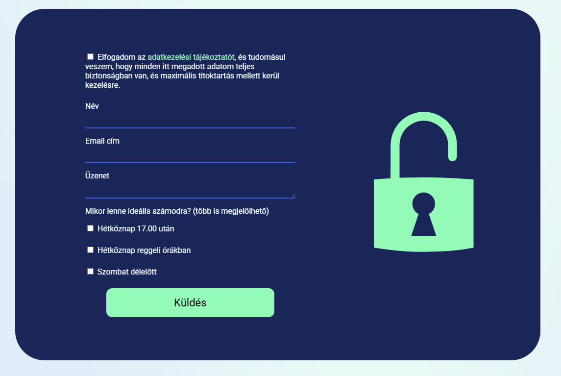
The result worked, technically, but wasn't perfect. Responsivity was an issue, and an unexpectedly long message could still break the layout. A small win was managing to bring over the lock-closing animation from saarylilla.hu (oh, Webflow how I missed you at this point, if only you weren't priced like an Adobe product).
Summary
This project wasn’t big or complex, but it was personal. A site for a friend, built with care and filled with small design touches that still feel good to look at. It taught me that even when a tool makes promises, there's no substitute for knowing your way around code—and for keeping your cool when things don’t go according to plan.
What I Learned
The good? I'm lucky to have friends like Viktor who trust me to do what I do best. The bad? Jumping into flashy new tools just because everyone on Twitter is hyped about them can backfire. Framer showed promise, but I ended up pivoting to custom coding befor I got to work with it again.