


Setting the Stage
From the start, this project was different. Lilla Saáry approached me not just for a logo or a website, but for a digital space that felt like a refuge, a welcoming room where people navigating sensitive topics could feel at ease. After a series of in-depth consultations, we laid out a clear path: a small-scale but impactful brand, a personal and practical website, and supporting materials like business cards and stickers. And throughout it all, one core idea: every visitor should feel like they’re stepping into a thoughtfully designed interior.
Brand Identity
Logo
After some intial sketching we decided to keep things subtle. The final wordmark is a mix of Playfair Display Bold Italic and Gowun Dodum. Professional with a dash of softness, it balances classical credibility with human warmth.
Colors
The palette avoids sterile whites and minty greens commonly associated with therapy websites. Instead, we chose:
- #DBA7A0: a warm, flesh-toned pink that hints at sensuality and openness.
- #95A4AC: a steely, balanced grey to counteract the softness and anchor the site with a professional undertone.
- #272222: a rich, dark brown used for text and interface accents, providing contrast without the harshness of black.
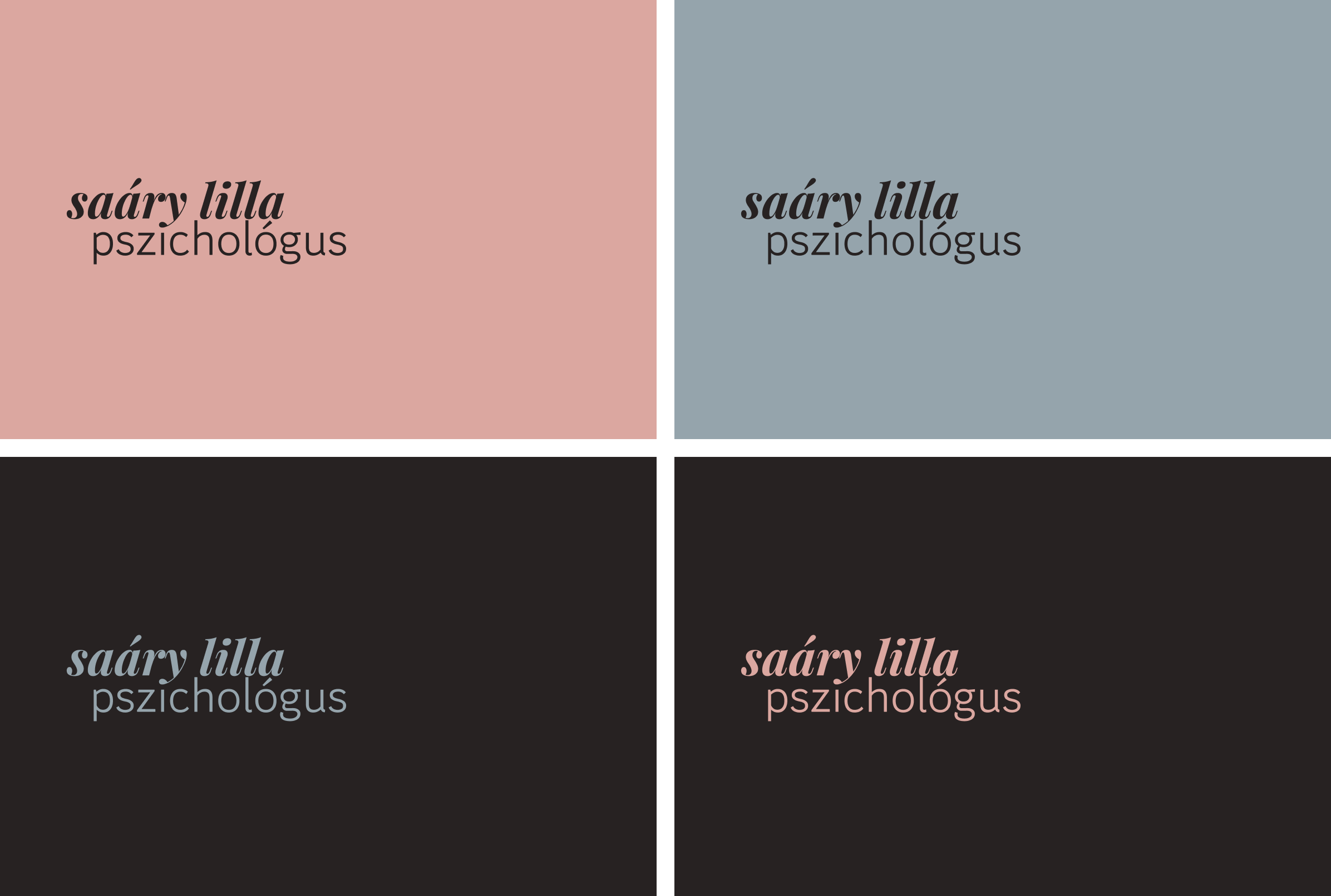
The two primaries are intentionally never used together, switching roles depending on the page. This rotation creates rhythm and avoids visual fatigue while reinforcing the site’s gentle tone.
Visual Language
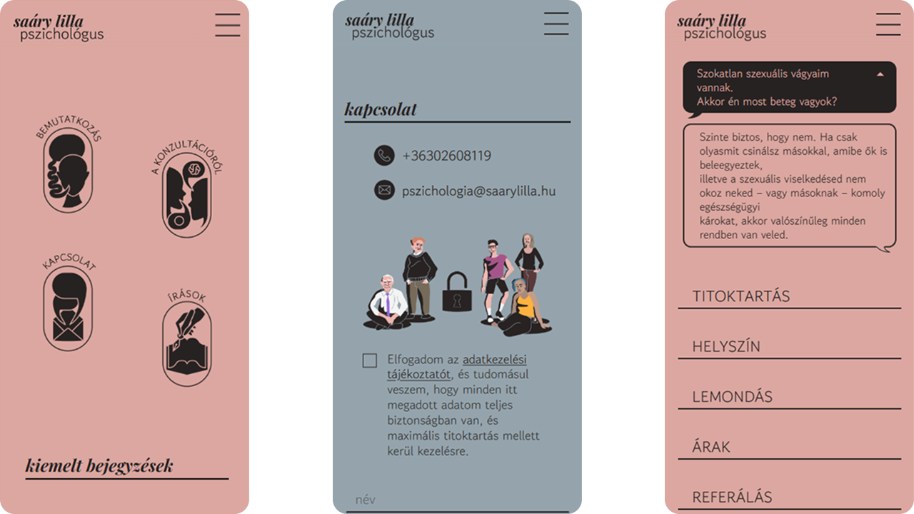
To support the brand further, we developed a set of pictograms. Instead of the typical minimalist icons we went for something larger, decorative, but still legible. Stylistically, they take cues from the boldness of old-school tattoo design. Each icon lives inside a vertical oval, subtly referencing doorways or portals—metaphors for entering a new, safer headspace.
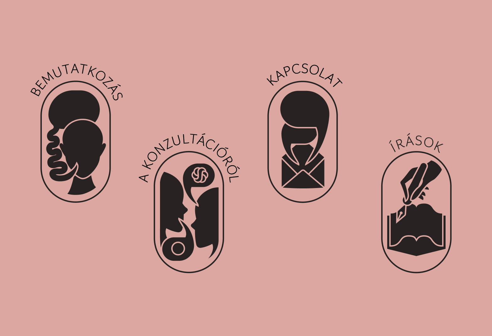
These motifs extend throughout the site, which was conceived as a kind of interior. Each page is a room. Each icon a doorway.
And like any well-designed home, it needed to be lived in. Enter our cast of illustrated characters.
Illustration as Invitation
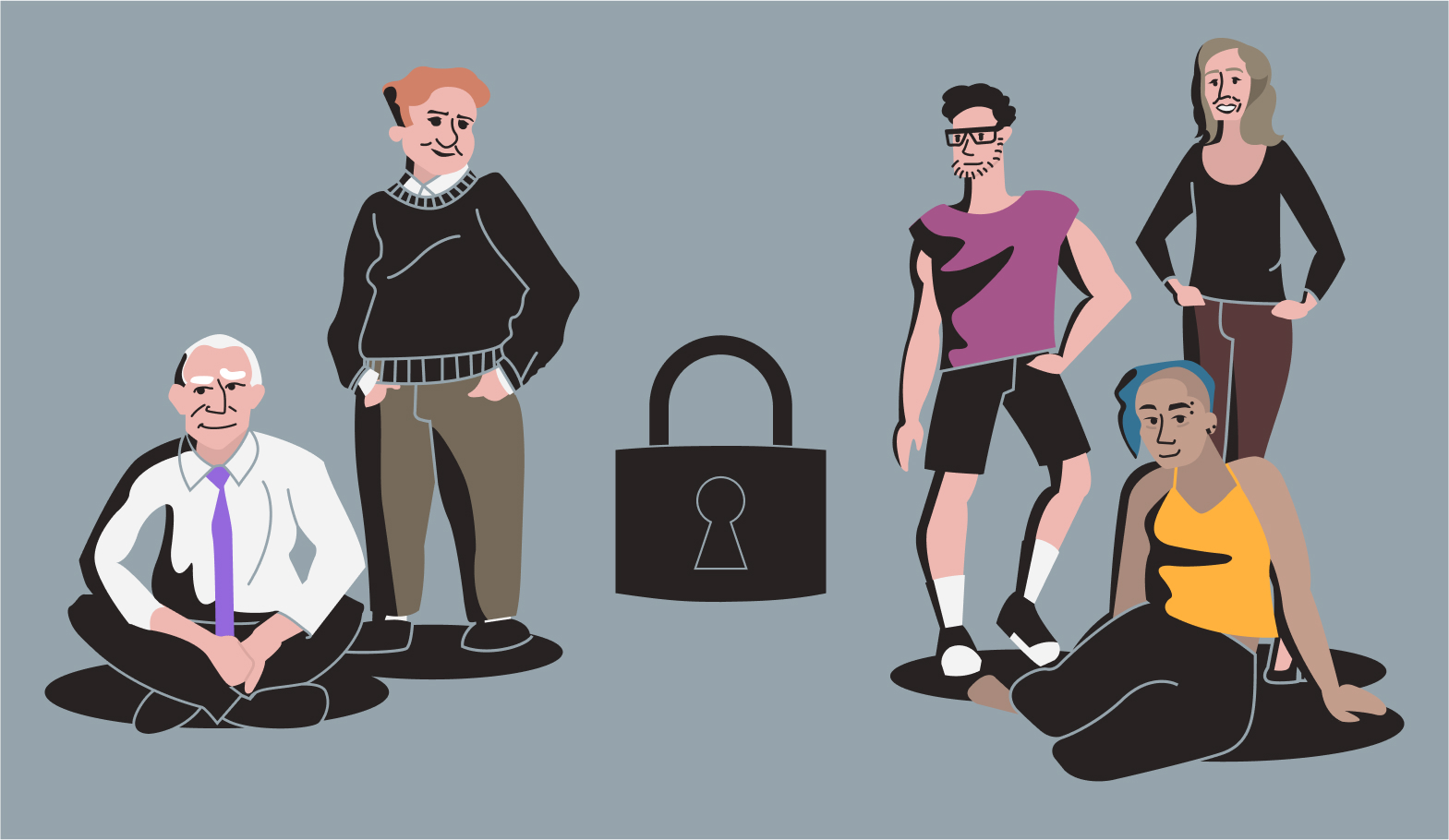
Together with Lilla, we developed a set of personas: diverse in gender, age, personality and presentation. Starting out as UX aids, these became full-color illustrations used throughout the site. They don’t just decorate—they greet, guide, and accompany the user, softening the journey and embodying the inclusivity the brand is built on.
Their most important moment comes at the end of the user journey, where they cluster together around a lock symbol on the contact page. Here, they quietly reinforce one final message: you’re safe here.
UX as Emotional Journey
This wasn’t a typical user flow where everything pushes toward conversion. For many of Lilla’s site visitors, reaching out for help is an emotional task that takes time. We designed the site to walk with them.
Navigation
Beyond the standard menu, the pictogram portals appear across all pages, letting users travel freely while staying grounded in their journey.
FAQ Integration
FAQs aren’t buried on a separate page. Instead, we surfaced them exactly where users might need them. When reading about confidentiality, for example, a floating speech bubble might ask, "But are you sure you won't tell anyone what I'm sharing with you? If you go to training, you must talk about each other's cases, right?" Clicking reveals the answer in a new, distinct bubble—keeping the tone personal and conversational.
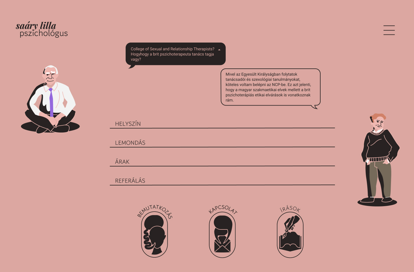
Contact Page
The form flips a familiar pattern. Rather than hiding the privacy checkbox, we make it the first visible element, placed directly beside our characters and a softly animated padlock that closes when checked. A small but powerful gesture: the journey ends in safety.
Summary
Creating Lilla Saáry’s brand and website was about more than visuals—it was about emotional clarity, warmth, and accessibility. Every design decision, from the color palette to the illustrated personas, served a greater purpose: helping people feel safe enough to take the first step. What began as a visual identity project became a digital space rooted in empathy that continued to attract clients for years to come.
What I Learned
This project reminded me just how much design can shape emotional experience. It also reaffirmed how branding isn’t just about aesthetics—it’s about atmosphere, values, and trust. Designing every detail, gave me the tools to turn abstract comfort into tangible UX.
While Webflow seemed like the ideal choice for flexibility and speed during development, it proved to be costly for the client in the long term. A few years later, I exported the code, rebuilt the CMS manually, and migrated the site to a more sustainable, self-hosted solution. It took time, but in the end, it resulted in a financially better arrangement for both the client and myself.