


A scientific institute without a place to properly publish its science. That was the state of The Works Research Institute when they first reached out. Their old website, a lonely, neglected one-pager, struggled to reflect the depth and complexity of their projects. The flagship initiative, Sphere, was barely featured, let alone lead the narrative. There was no content architecture, no CMS, no flexibility. Just static text and a missed opportunity.
So we started from scratch.
Balancing logic and looks
The Works Research Institute didn’t need a shiny startup site or an e-commerce funnel. They needed a digital publication space that felt as intentional as their research. My job was to turn their existing identity into a living, breathing interface, and build the backend that would support it for years to come.
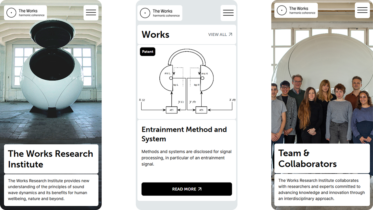
WRI already had the foundations of a solid visual identity: a great logo and wordmark but they hadn’t been using them to their full potential. My early concepts focused on putting Sphere front and center. All three initial iterations prioritized imagery of their most visually interesting project. The final direction emphasized Sphere in its natural environment, emphasizing the point that it is a real-world tangible object not just a vague concept.
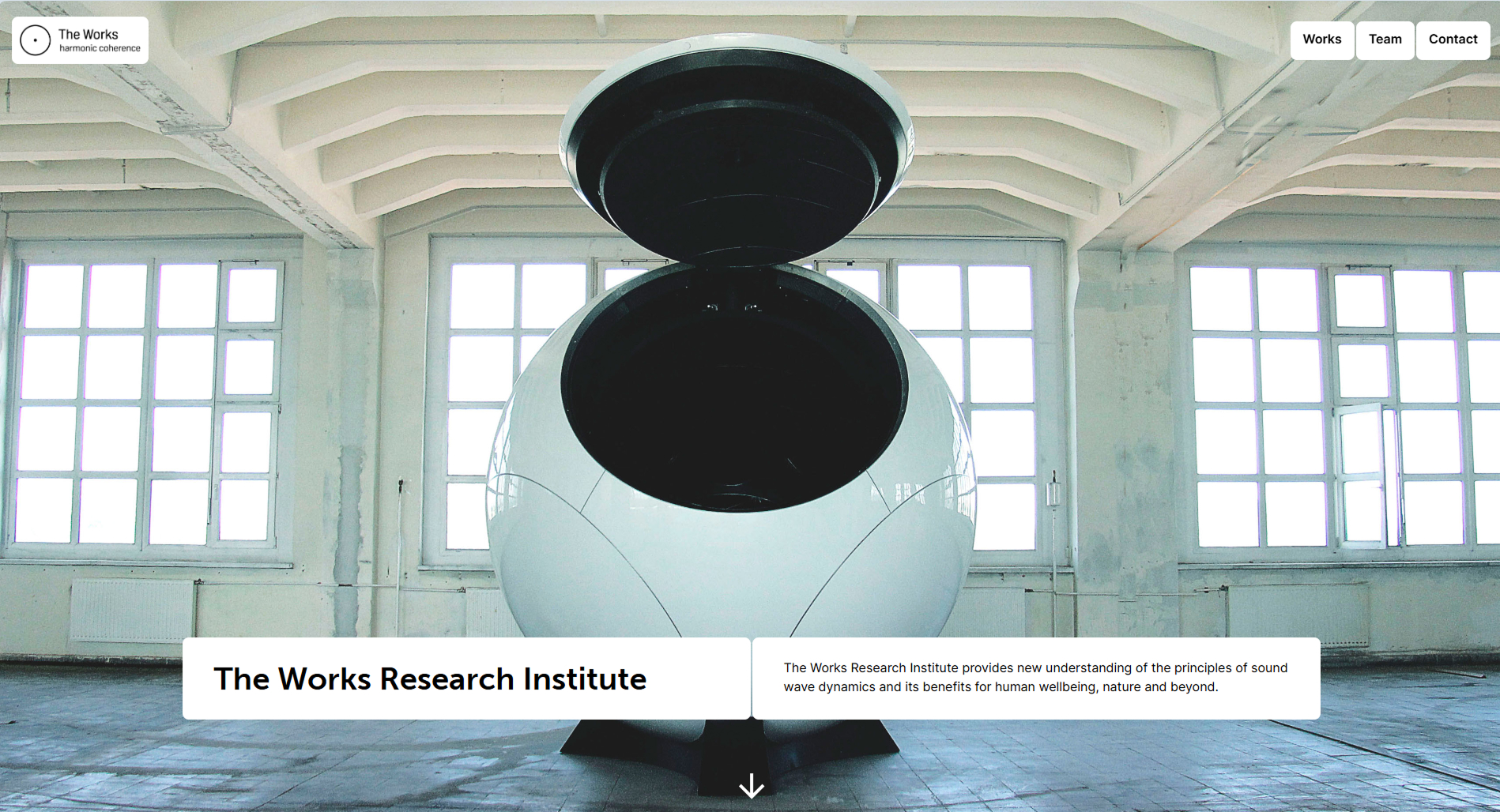
The visual language builds on WRI’s existing assets, enriched with a brutalist-inspired greyscale palette and typefaces to match. There’s no gimmick here. The design mirrors the tone of academic work: focused, precise, and grounded with just enough warmth to avoid sterility.
Code, content, and control
Once the design was locked, I moved into development—writing a fully custom frontend using clean HTML and CSS, with just enough JavaScript to handle interactions smoothly. Nothing fancy, just focused, performance-first code that does what it needs to do without unnecessary baggage.
Behind the scenes, the site runs on Decap CMS, integrated with Eleventy (11ty) as the static site generator. I chose this stack to give the client full control over their content without locking them into expensive subscriptions or limiting templates. It also ensured that what I designed is exactly what ended up online.
There are two core CMS collections:
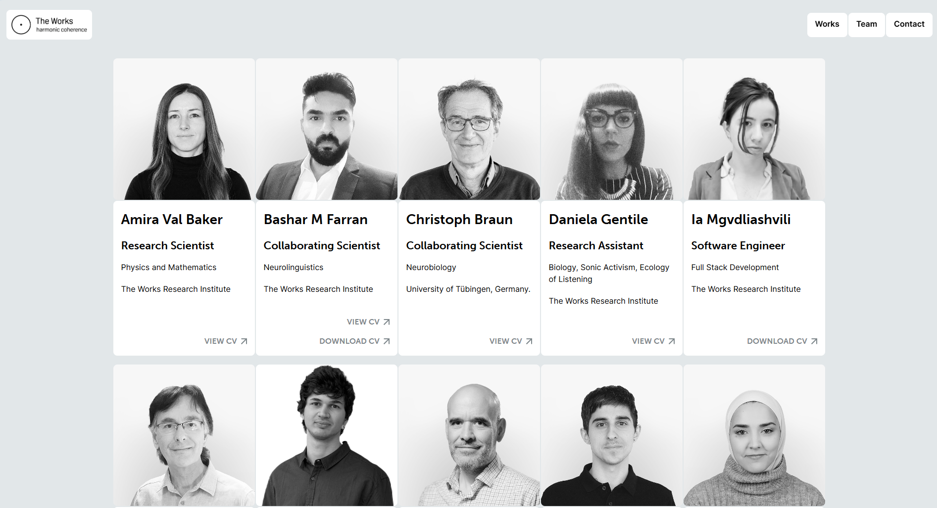
Team – The mandatory collection to show off your talented employees. The fact that we’re not building a traditional corporate site comes into play with team members having the option to link academic profiles, or upload CVs. Doing so inserts a button into the frontend with the respective label automatically. It’s a small feature, but one that helps keep the user experience frictionless on both ends.
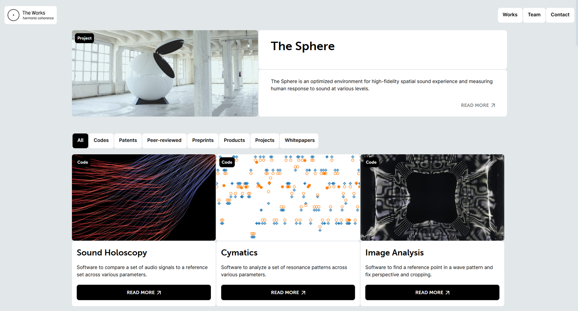
Works – This collection powers a structured, article-style content page. Content that’s even more dynamic than your regular CMS comes into play here as well. Depending on values of certain fields, the category of the publication, and sometimes these in interaction, the frontend automatically includes certain elements. An example is a link leading to either the published article or the code repository. Instead of having two different fields for these in the editor, the label switches from from “Read full article” to “Access full code” if the category happens to be code. These examples are just part of a larger, structured layout designed to accommodate different publication types while keeping the visual and editorial style consistent.
The Works listing page itself is ordered in a specific way that reflects the client’s preferences: sorted primarily by category, and within each category, newest entries appear first. Visitors can filter the page, and these filters are shareable: each filtered state has a unique URL, making it easy to link to specific subsets of the research.
All in all, the content management experience is simple but powerful. An interface WRI can use confidently without technical support, and a structure that grows with their work.
Summary
This project was a balance of design restraint and technical challenge. While it had no traditional conversion points or flashy interactions, it needed to function like a high-trust academic archive: quiet, precise, and reliable.
What I learned
Wearing every hat, from designer to developer to project manager to client liaison, reminded me how intense solo freelancing can be. Even with a smooth process, juggling everything takes its toll. But the payoff is complete creative control and a final product that aligns perfectly with the client’s needs.
On the technical side, this project reinforced the power of custom code. Some of the conditional logic and UX details just wouldn’t have been possible—at least not cleanly—in a standard sitebuilder. Building everything from the ground up gave me the freedom to prioritize usability without compromise.